Our Ireland charity walk data visualisations are in
Back to BlogNow the Wood for Trees team have fully recovered from March’s virtual charity walk around Ireland, in aid of Concern Worldwide’s Ukraine Crisis Appeal, some of our analysts have had time to put their visualisation skills to the test with the copious amounts of data collated via Big Team Challenge.
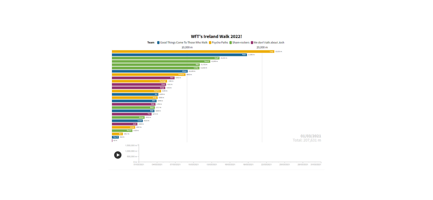
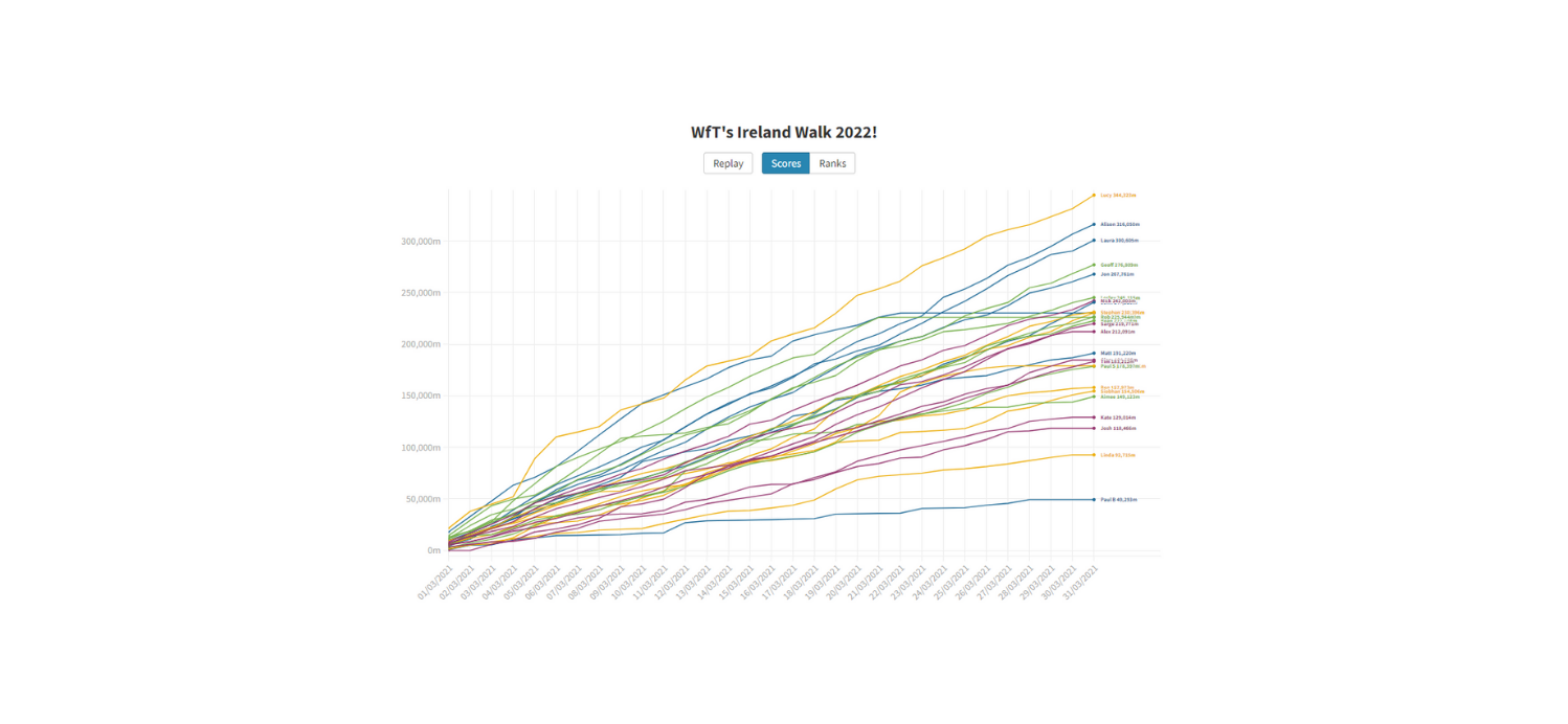
First up are Peter’s bar and line charts depicting everyone’s individual progress over the month, created using Flourish. Although bright and beautiful standalone, it’s much more fun to watch everyone’s journey unfold via the animations. Watch the bar chart animation here and line chart here.
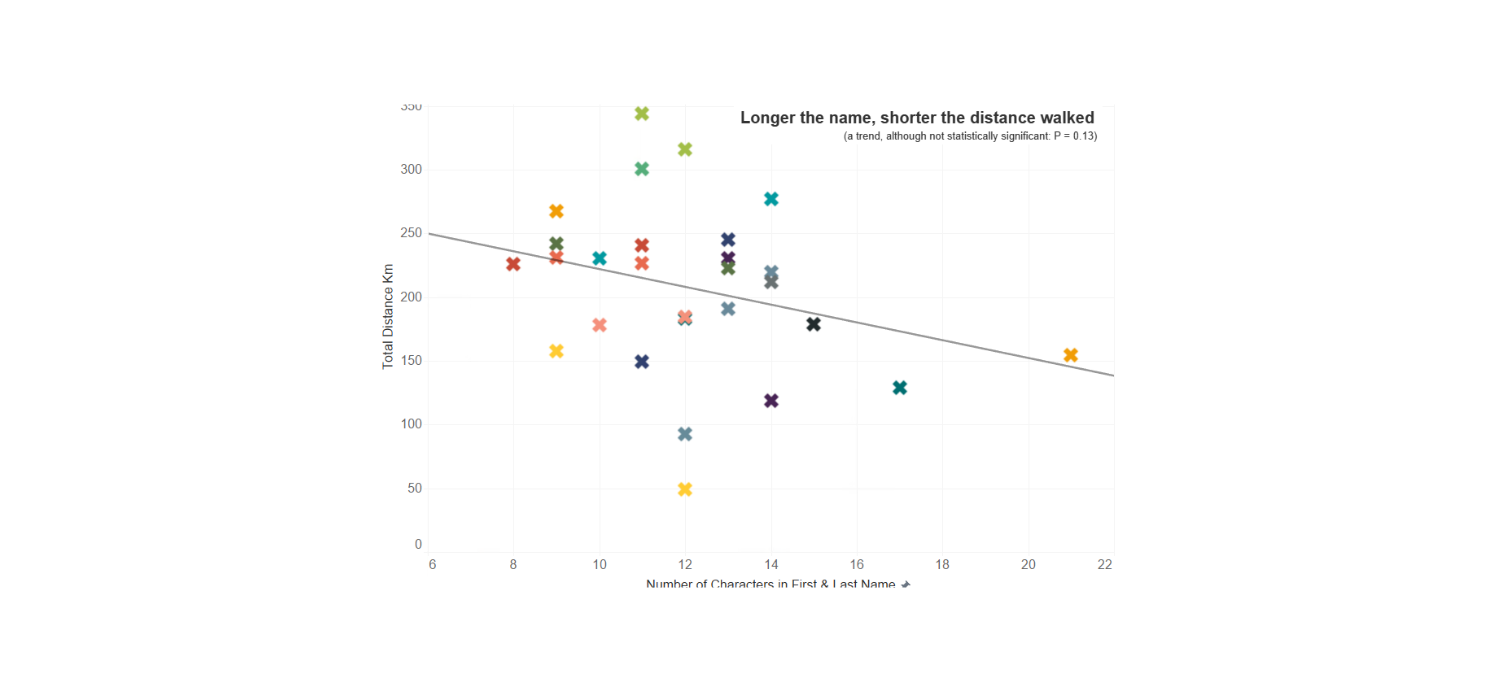
Next is Kayleigh’s colourful scatter graph, which shows (purposefully naming no names) a trend (not statistically significant, but a trend nonetheless) that those with longer full names tended to walk the shortest distance.
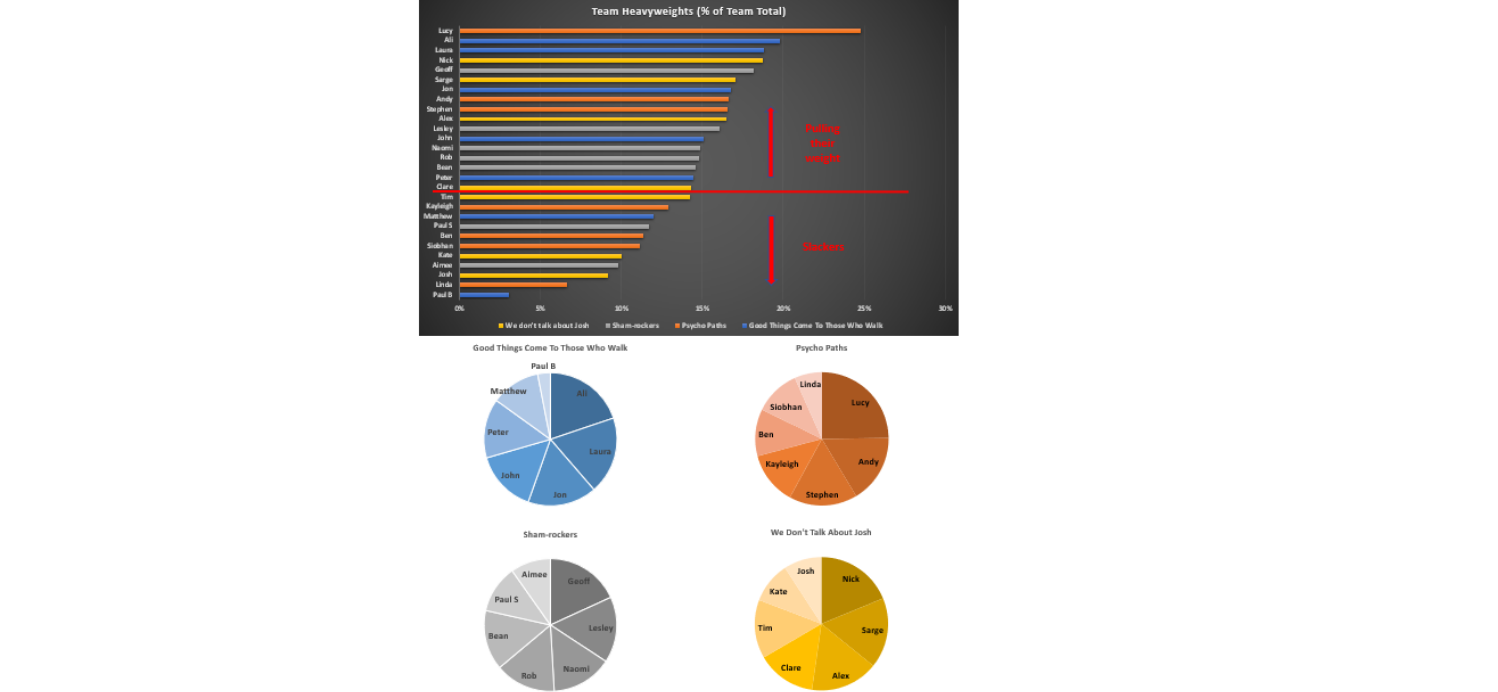
Jon’s approach was slightly different to Kayleigh’s in that he wanted to find out exactly who pulled the most weight in the challenge, and who didn’t, from analysing the data. You can see his (perhaps quite brutal) take on the matter below!
Jon also compared the performance of those who took part in last year’s Camino de Santiago virtual walk versus this year’s challenge. These horizontal bar and line charts clearly show much improvement from Josh, as well as many others in the team!
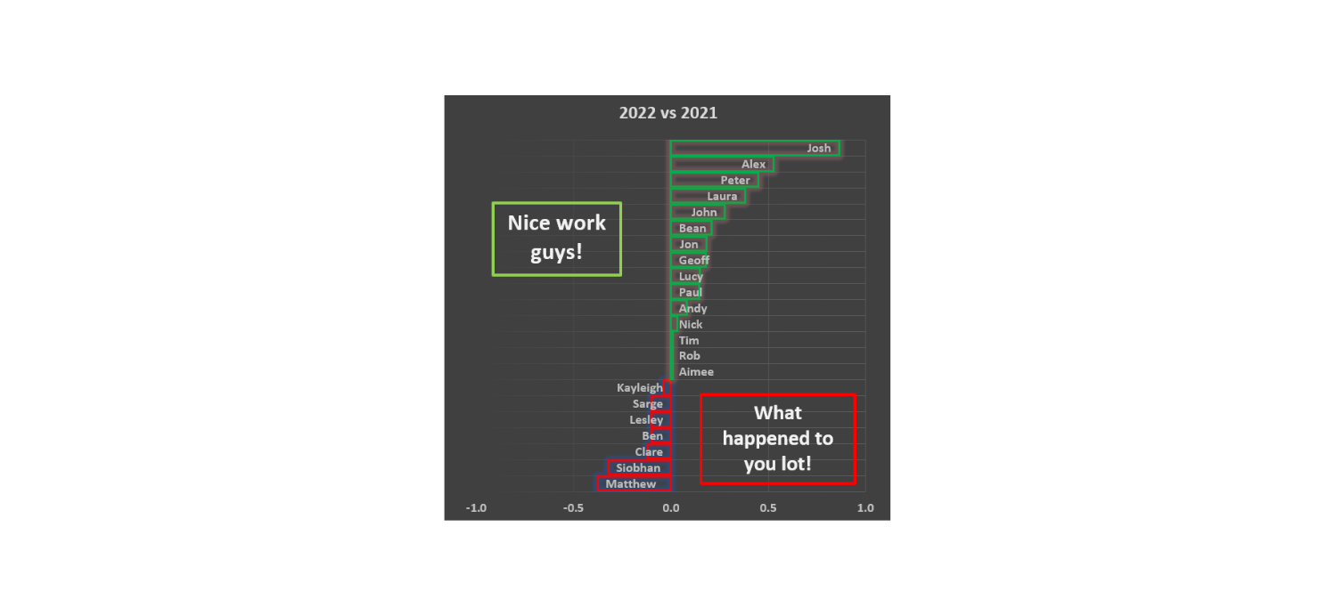
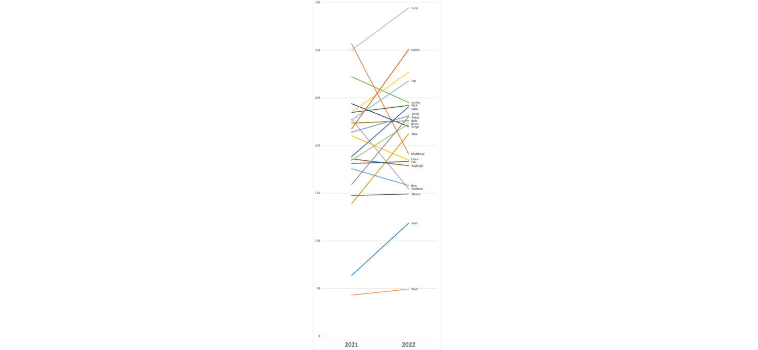
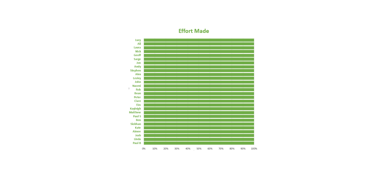
However, Jon was then reminded it’s not all about comparisons and league tables, and who walked furthest – it’s really the taking part that counts, along with the funds raised for a worthy cause. Here’s his final view…
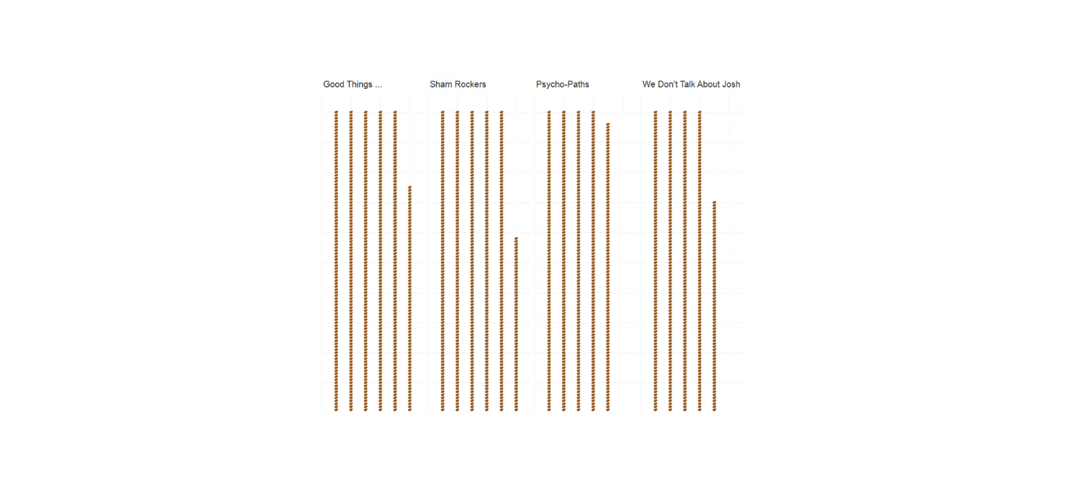
Rob stuck to the Irish theme and created a chart with potatoes. He took the number of steps taken by each team and calculated roughly how many calories that would burn using the average height and weight of UK adults. He then found the calorie count in an average sized potato (163 if you’re wondering). With calculating the approximate number of potatoes burned off by each team over the course of the challenge, Rob created a visual using a picture of a potato and voilà – here’s his potato waffle chart.
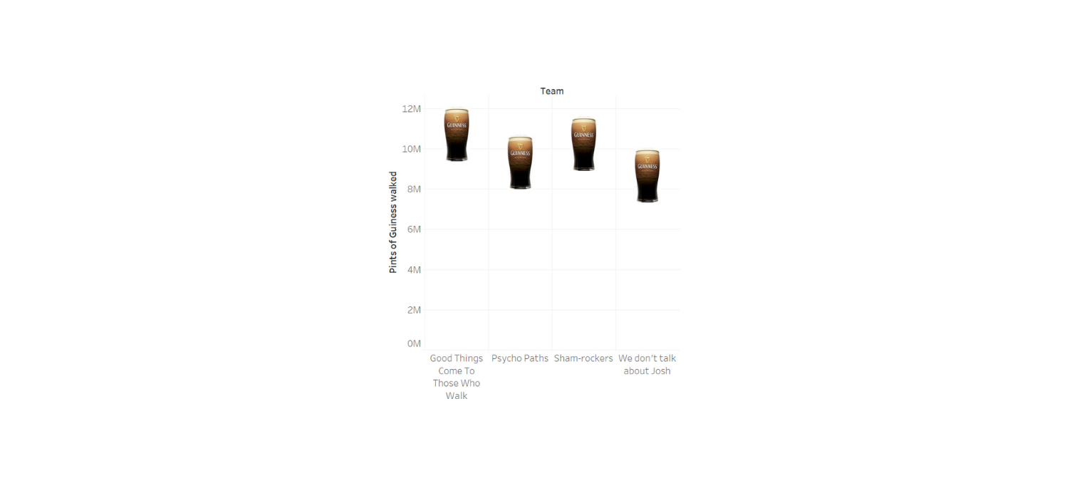
In a similar style, Daniel created a chart depicting the equivalent distance walked by each team in pints of Guinness.
As the saying goes, a picture… or a potato or pint of Guinness… paints a thousand words! If you have any visualisation suggestions or requests using our charity walk data please let us know by emailing getinfo@woodfortrees.net. You can also visit our blog page here to learn more about our fundraising efforts, past and present.