Another year passes and another Wood for Trees staff charity event has come to a close. This year lockdown forced us into a virtual event, our Camino De Santiago, and with that came a stream of walking log data. And what does any other group of data nuts do when they get hold of a dataset that inspects every step a colleague has done over the last month? They dig in and find out interesting pieces of insight that can be derived from it!
Here are a selection of our favourites from across the team, as voted for in our very strict and highly competitive competition.
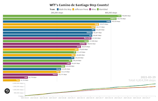
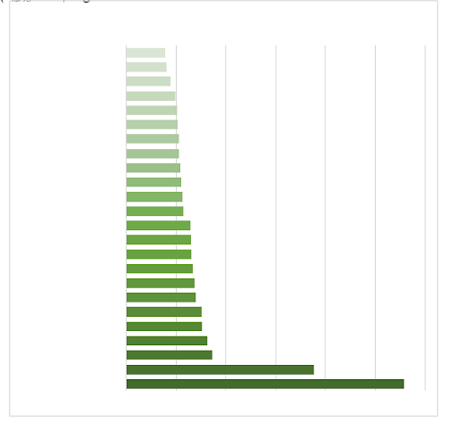
The data engineering team pulled out all the stops and took home the crown jewels in the competition with three strong entries. The winner entry was Peter with his animated bar chart race. Worth watching the race to experience the full mesmerising effects, and watch Matt racing towards the top of the leader board.
https://public.flourish.studio/visualisation/5806623/
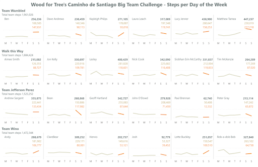
Tim’s initial attempt of using walking data as a proxy for sleep patterns got overtaken by his pixel perfect desires with making a small multiple’s line chart across days of the week. Some really interesting patterns emerge showing which days most people are active on – for example Bean clearly doesn’t move on Sundays whereas for Kayleigh this is the day to get out and about. Across the board it truly looks like Sunday is a day of rest, with only 25% of people increasing their distance on Sunday compared to Saturdays.
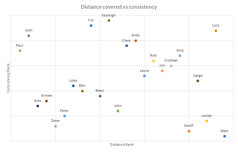
Whilst Lucy cleverly made some black box calculations to try and get Josh and Paul somewhere near the top of a chart, but most importantly, to point out how successful she is at being both consistent and committed to the cause.
The analysis team obviously enjoyed taking the more humous route that what they need to do in their day jobs. Geoff’s years of analytical prowess made him realise what he has been missing all of these years with a sterling example of a blown-up 3D pie chart. Despite his interesting choice in visual, in true analyst style he identified a nugget of insight that half of all steps were done when we were meant to be working.
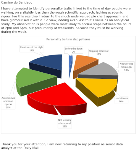
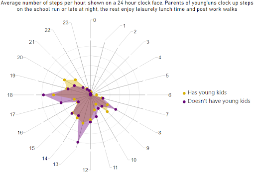
Kayleigh clearly identified the challenges of parenthood versus the luxury life of those who don’t have young kids. Those without children have leisurely strolls over lunchtime and as soon as they clock off from work. Whilst parents of young children are trapped until the kids are in bed. Does make us wonder what the plot of children’s age is over walking freedom.
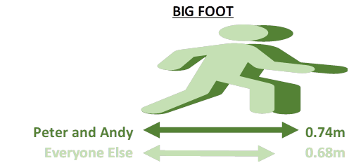
Jon’s love of picking out the outliers came into force with his “Big Foot” and “How many years will it take Paul and Josh to walk the trail” visuals (Jon will forever be lumped in as an analyst, despite his managing director job-title). Somehow Andy bucked the natural intuition that height and step length are correlated by a significant stride. Whilst Josh and Paul will still be walking the route by the time next year’s WfT event takes place.
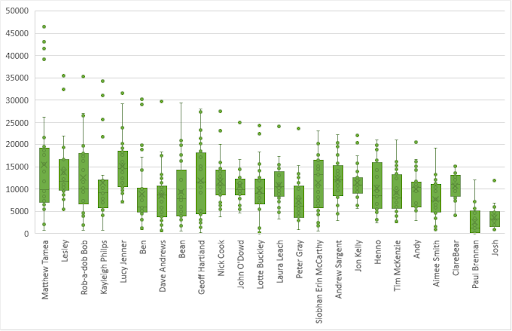
Last but not least, a special mention to Bean from the account management team who made us all realise she should be in the analysis team with her mathematical genius. This wonderful chart clearly demonstrates those who were more consistent in their walking, and those who relied on one or two enormous hikes……Matt.
We hope you’ve enjoyed this fun take on our walking experiences, and it really shows the truth that a picture paints and thousand words.
