Power BI tips and tricks
Back to BlogMicrosoft’s Power BI software features an array of digital apps and services that help organisations manage and analyse their data, turning it into actionable insights through visual graphs and charts.
Working with charities and not-for-profit organisations, our analysts use a range of Power BI tools to process and visualise huge quantities of data, such as supporter information, fundraising activities and income generation, helping spot and predict valuable trends to inform strategic decisions.
Many of the reports and dashboards available in our charity benchmarking and reporting platform, InsightHub, have been created using Power BI by our Power BI Analyst, Tim McKenzie. For data analysts familiar with using Power BI, Tim shares his top tips for getting the most out of it.
Build your own date table
Use your own date table dimension instead of the automatic date hierarchy Power BI produces.
Have a date table pulled from your own database, or a Power BI dataflow, to ensure all users have access to the same date table for better reusability, consistency and continuous improvement.

This will allow greater flexibility and tailoring for your Power BI solution to meet the needs of your organisation. You can have fiscal periods defined as well as working days, holidays and many other elements that may be applicable.
If your fact table has a date/time column, consider splitting the date and time elements into separate columns or remove the time element if not required. This will dramatically reduce the cardinality of the column and related dimension table, which will result in a smaller model size and improvements in query performance.
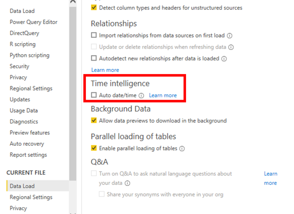
Also, disable the auto date/time because this creates hidden date tables for every date column in your model, which can bloat your model unnecessarily.
Decouple datasets and reports
Build your Power BI datasets and reports as separate pbix files.
Build the dataset and publish to Power BI Service. Then, build your report as a ‘live connection’ to the published dataset. At Wood for Trees, we favour having workspaces that only contain datasets and other workspaces that only house reports and dashboards.
Some people refer to this architectural approach as a ‘golden dataset’. This creates many advantages. Most importantly, you reduce the duplication of business logic that can lead to disparities and be challenging in keeping all datasets in sync with the latest logic. This means your data teams can control the certified logic, whilst end users can build reports using a dataset they know is accurate.
Version control
It’s common across software development to version control your work and a Power BI environment should be no different. However, it’s not as common to see teams doing this with their Power BI assets.
The easiest approach is to implement a workflow using Microsoft Sharepoint, Teams or OneDrive. This is a good starting point if you don’t currently have anything in place.
The more challenging approach, which has serious advantages, is to introduce a full DataOps pipeline. We implement ours with a combination of Power BI Desktop, Tabular Editor, Visual Studio (VS) Code, PowerShell and Azure DevOps.
We use Tabular Editor to split our data model into a JavaScript Object Notation (JSON) structure, which allows for code merging and clearer visibility of the changes made in your source control system.
VS Code is used to control commits and pushing to our remote repo. When the commits are pushed, Azure DevOps automatically kicks off our builds and deployments through Dev, UAT to production environments. In our Azure DevOps environment, we install an instance of Tabular Editor, which manages all the deployments, Best Practice Analyzer checks and schema checks.
Power BI assets can become invaluable tools that are used throughout your organisation. So, you should always ensure you protect them.
Calculation groups for formatting
Calculation groups are a very powerful recent addition to Power BI. They allow you to apply specific calculations across any DAX measure, providing a place for your calculation logic and reducing the number of measures needed in your model. To make calculation groups you must use an external tool like Tabular Editor.

Most commonly, people tend to create calculation groups to manage their time intelligence measures. However, it doesn’t need to end there. We have a formatting calculation group we hold in every one of our datasets. This can be extremely helpful to adjust the base models formatting or force formatting on particular custom visuals (e.g., advance card) that don’t support the native Power BI formatting very effectively.
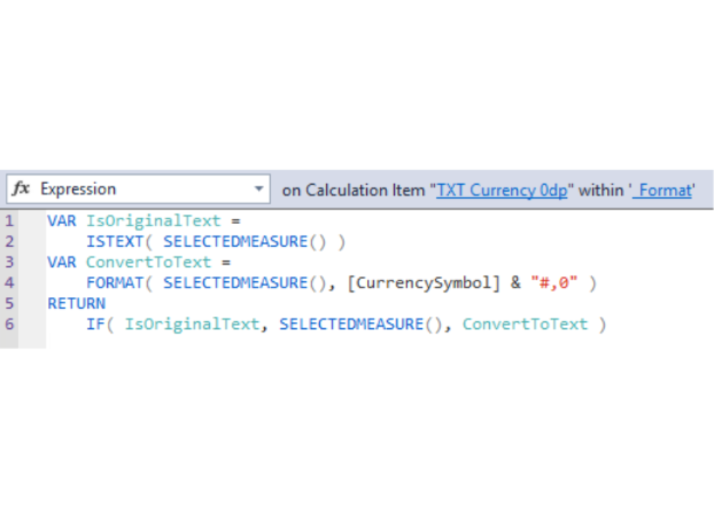
Our _Format calculation group holds two different forms of formatting options: ‘TXT’ and ‘VALUE’. For each form, we have currency, number and percentage formatting at different decimal point granularities. The TXT method converts the measure into a string with the required formatting applied. This is helpful to format the advance card custom visual or other similar elements.

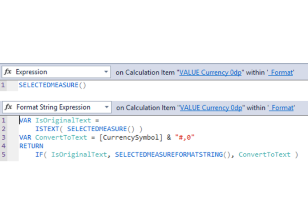
The VALUE method applies the change in the ‘format string expression’, whilst the ‘expression’ throughputs the selected measure. This is helpful because it can be applied to any visual and maintains its ‘number’ state, hence it can maintain sorting and other features.
If you aren’t using Tabular Editor already, this is just one of the many features you can use that aren’t available in Power BI Desktop. Control of ‘object level security’ and ‘perspectives’ is possible, and productivity increases because you’re not waiting for Power BI to recalculate each time you adjust a DAX measure.
We hope you find these Power BI tips and tricks helpful. To learn more about how Power BI or InsightHub could benefit your organisation, contact us here.
